You love HTML email messages, don't you? If you have to design them, you probably don't. On the other hand, subscribers love it, devour it, consume all this content on a daily basis, and bring a lot of revenue for companies that take email marketing seriously.
But it can be a nightmare to create email messages that display reliably on the majority of all email clients while taking into account things like best practices, accessibility, and good looking design.
For that reason, I want to share some tips to help you solve some of these problems.
1. Keep it within 600px wide
Just like web pages, email messages also need to take into account the reader's focus. Numerous eye-tracking studies clearly show that, on average, users skew towards scanning a page rather than reading it word by word, and content in the left usually gets more attention than in the right. Forcing users to read a wider length than 600px will simply affect your email's response rate.
2. Use a preview text
Rounding up a summary of your message into a small consumable text just below your subject is a great way of gaining attention in the user's inbox. Failing to provide a preview text (a.k.a. pre-header) will significantly make your email message less appealing.

To implement this is very easy. Just below the opening body tag, add the following:
<div style="display: none; font-size: 1px;max-height: 0px; max-width: 0px; opacity: 0; overflow: hidden; mso-hide: all; font-family: sans-serif;">
Insert you preview text here
</div>
This will make sure that email clients use this text while also making making sure that it will never be visible in the content of your message.
If your pre-header text is not big enough you can also add a little hack to make sure some white space is added filling the rest of the allotted space. This is done by adding a second pre-header containing a chain of zero-width non-joiners ‌ and non-breaking spaces just after it:
<div style="display: none; font-size: 1px;max-height: 0px; max-width: 0px; opacity: 0; overflow: hidden; mso-hide: all; font-family: sans-serif;">
Insert you preview text here
</div>
<div style="display: none; font-size: 1px;max-height: 0px; max-width: 0px; opacity: 0; overflow: hidden; mso-hide: all; font-family: sans-serif;">
‌ ‌ ‌ ‌ ‌ ‌ ‌ ‌ ‌ ‌ ‌ ‌ ‌
</div>3. Accessibility
Everyone designing for email hate the fact that we’re still stuck using tables for layout in email. Although some email clients already provide a reasonable support for CSS layout positioning, you will need to use tables to make sure your messages look good in Microsoft Outlook.
But HTML tables can be pretty annoying for those users using screen readers. After all, a screen reader will see a table and will do its job and read what it expects it is... tabular data. This is where ARIA roles come in handy. By applying the role="presentation" to all of your tables you will instruct screen readers to skip them and move straight to your content.
4. Add a view online link
Because a lot of things can go wrong with the email clients (images don't load properly, your design is failing, etc.) it's always a great idea to add a link to a web version of your message. With Notificare Components this is easily added by dragging a component into your structures, but you can also easily do this with your own HTML content by adding the following:
<div><a href="{{view}}">View this email online</a></div>5. Tracking open messages events
Most marketers will want to track the performance of their messages. Again, if you are using Notificare Components tracking open messages and link clicks will be done for you automatically. Still, if you are using your own HTML content, you will have to add a tracker yourself (links are already automatically tracked for you). This is done by adding the following code right after the opening body tag:
... more markup
<body>
{{tracker}}
... more markup
</body>
... more markup
6. Add a clear CTA to your message
Keep things simple when designing messages if you want to achieve higher conversions. Because users, on average, only read the top content of your messages, it's important that you always provide a main Call-To-Action in the first pixels of your message. This will ensure that you will at least capture some clicks even for those less engaged customers.
7. Use system fonts fallbacks
Sadly, most email clients do not support web fonts, rendering it impossible to always achieve the best email design that matches your brand's look & feel. For this reason, you should always provide a fallback font like Arial, Verdana, or Georgia. You can always provide a web font as your main choice but don't forget to add also a sensible fallback:
body {
font-family: "Proxima Nova", Arial, sans-serif;
}
8. Use alt text in your images
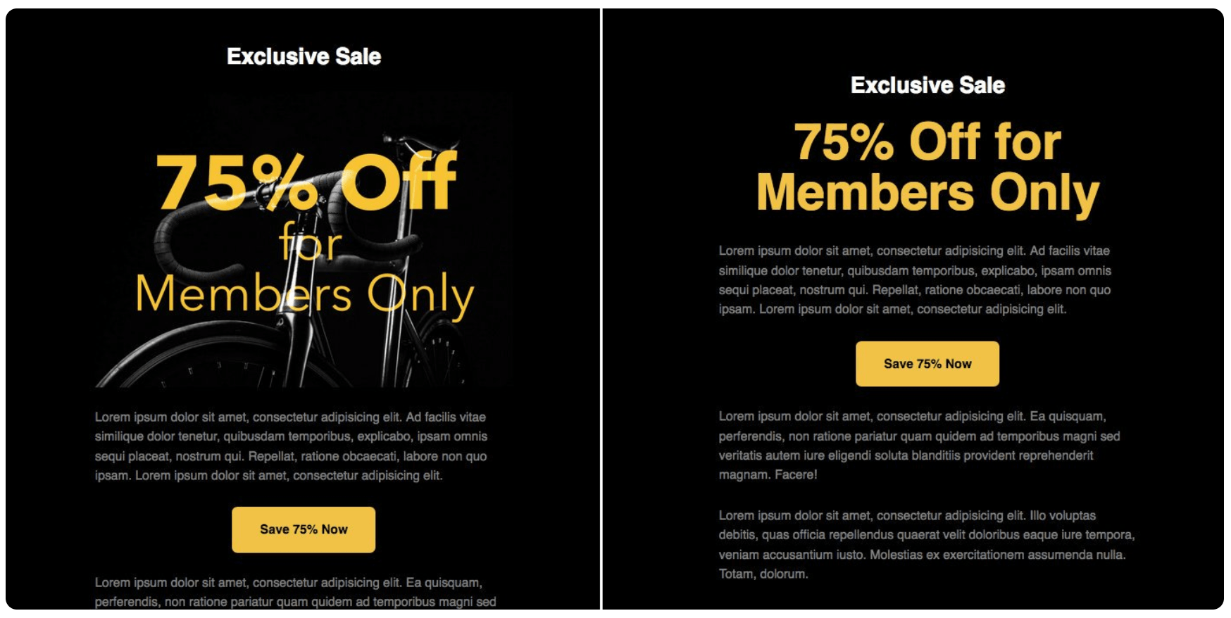
A lot of email clients will also block your images by default until users opt-in to display them. This means that all that artwork you added will not be visible. A great way of coping with that is by adding an alt text to all your images, which will always be displayed even when images are blocked. These can even be styled offering you a way of creating a reasonable fallback for when images are blocked:

This can be achieved by adding some extra CSS style to your image:
<img alt="75% Off for Members Only" src="https://mydomain.com/images/bike.jpg" height="300" width="600" style="background-color: black; color: #f8c433; display: block; font-family: sans-serif; font-size: 72px; font-weight: bold; height: auto; max-width: 100%; text-align: center; width: 100%;">9. Background images are a no-no
Unfortunately, background images are stripped out in many of the major email clients out there. Although they can still be used, simply avoid any situation where your content only makes sense with a background image. Always provide a solid background color as a fallback or risk ruining a great design because a nice background texture or shadow effects are not there.
10. Wrap links around bigger images
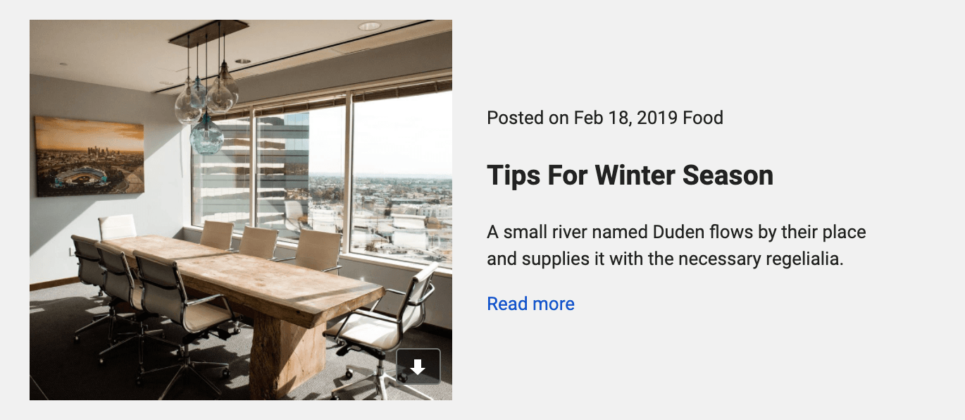
A popular email client (looking at you Gmail) will make your images downloadable by showing a really annoying icon when a user moves the cursor over an unlinked image:

Preventing this is actually pretty simple. By simply adding a link to your image you'll automatically disable this behavior:
<a href="#"><img src="https://mydomain.com/images/image.jpg"></a>Test, Test, Test
This is just a quick breakdown of some rules of thumb when designing for email. There are plenty of other things we could cover in this post but our last and most valuable suggestion is that you should test your messages. Notificare offers the possibility to test your messages in more than 90 email clients out there before rolling your campaigns to a broad audience. Besides providing you with screenshots taken from real devices, we will also perform SPAM tests, markup analysis, and scan your content for broken links or images.
If you would like to get a preview of this and many other great features for email campaigns, simply send a message to our Sales Team or drop a line in our Support Portal.


