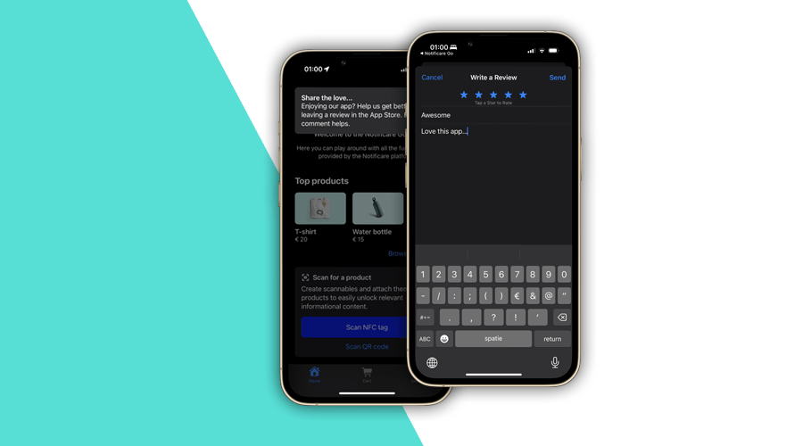
It is a known fact that almost 50% of users in the App Store and Google Play discover apps through search. It is also known that the ranking also highly influences how your app appears in search results. Additionally, around 60% of users rely on reviews to decide which apps to install. Therefore, it is safe to say, that ratings and reviews of an app play a pretty significant role in your app discovery and user acquisition.
Since the launch of our SDK 3.4, with support for In-App Messages, we have been publishing use cases for this functionality. This post is no exception. Let's discover how you can use in-app messages to motivate engaged users to rate your app or leave a review.
Setting Up
We'll start by defining a name and context for your in-app message.
It is also important to highlight that you might not want to show this message every time the app launches. If that's your preference, you will want to use a more conservative frequency for these in-app messages.
Because we'll use the store's web page, it will force us to create 2 different in-app messages, one for iOS and another for Android.
It is also very possible that you release each platform at different moments. For these reasons, using different in-app messages for each platform just sounds the most reasonable choice.
Targeting Users
When it comes to app ratings and reviews, it is common to request a review after a new version is released. Because Notificare tracks these automatically for you, you will be able to target users using a certain platform and app version.
Please also note the segment we use to target users that did not interact with this in-app message. We will be adding users to this segment whenever they follow through, preventing them from seeing this in-app message again.
You will also want to make sure you exclude users that just downloaded your app or did not onboard yet. For the sake of simplicity, in this example, we are leaving these scenarios out, but you should make use of our powerful criteria to create fine-grained criterion that accounts for your specific case.
Defining a Duration
Optionally, you might want to define a period of time when this in-app message is relevant. This will make sure users get acquainted with this new version of your app before you trigger this message.
Displaying Content
In this example, we are using our simplest form of in-app messages, the Banner. It is the less disruptive type and can be easily dismissed by the user. But it gets the job done without nothing more than a simple copy and a link to the store. Of course, you can still choose one of the other types, the Card or the Fullscreen.
In iOS, this would look like the following:
And in Android, you would have to use a slightly different URL:
Obviously, you would need to use the App Store ID and Package Name that applies to your app.
Worth noticing that we are also making sure that when the user clicks this banner, we will add them to a segment. This will prevent that this message is shown again.
And the result is pretty good, a small banner appears whenever users open your app using the platform and version you've defined:
Users that click it are sent to the store, where they can easily rate your app and leave some feedback.
And this works pretty much the same way in Android too:
Taking it Further
This is just a simple example that you can tap into without any app development. But your team could even take this further. Using an in-app review integration, available for both Android and iOS, app developers can create a solution for ratings and reviews. Because in-app messages work perfectly with deep linking technology, pointing users to your in-app review integration (preventing users from ever leaving the app) would make this the go-to feature of your app, when you're craving for fresh new reviews.
If you have any questions about how to get started with this type of messages, feel free to reach out or create a demo app and test it yourself today.


