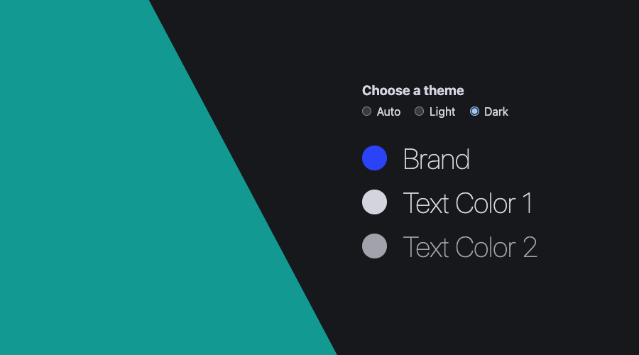
In a world where the number of browsers supporting color schemes is significant, web developers no longer need to jump through hoops to provide a decent user experience. Users simply love it too! It is estimated that around 90% of users switch to dark mode, when available.
In this post, we will demonstrate how you can build a brand's color system that adapts to user preferences while keeping the developer's authoring experience minimal.
Often, a brand's color guide has been established and delivered as HEX or RGB values. This most likely translates to defining the brand's color as follows:
* {
  --brand: #2B42F7;
}
In order to introduce a concept of darkening or lightening a brand's color, we will need to first convert it to HSL (hue, saturation and lightness):
* {
  --brand: hsl(233 93% 57%);
}
But to enable the concept of darkening or lightening a color, we will need to define the 3 channels, of the HSL color, separately:
*{
  --brand-hue: 233;
  --brand-saturation: 93%;
  --brand-lightness: 57%;
}
CSS is powerful enough to allow you to do computations and dynamically calculate values.
For example, if you would like to adjust the lightness of a color by 10%, you can easily do that by using calc():
* {
  --brand: hsl(233 93% calc(var(--brand-lightness) + 10%));
}
This will allow you to easily build a color scheme based on the same hue family by simply tuning the saturation and lightness values.
In a real world example, you would define a light and dark theme for you web app as follows:
* {
  /* foundation */
  --brand-hue: 233;
  --brand-saturation: 93%;
  --brand-lightness: 57%;

  /* light */
  --brand-light: hsl(var(--brand-hue) var(--brand-saturation) var(--brand-lightness));
  --text1-light: hsl(var(--brand-hue) var(--brand-saturation) 10%);
  --text2-light: hsl(var(--brand-hue) 30% 30%);
  --bg-light: hsl(var(--brand-hue) 25% 90%);

  /* dark */
  --brand-dark: hsl(var(--brand-hue) var(--brand-saturation) var(--brand-lightness));
  --text1-dark: hsl(var(--brand-hue) 15% 85%);
  --text2-dark: hsl(var(--brand-hue) 5% 65%);
  --bg-dark: hsl(var(--brand-hue) 10% 10%);
}
Above, we are defining the same brand color for both themes, while creating different color variations for other types of elements. In a light theme, the page color should be light while the text should be very dark. That's why we are defining the lightness of text with a very low percentage and the background with a high percentage. For a dark theme, we will use the opposite, and define low lightness percentages for the background while adjusting lightness for the text with very high percentages, putting those colors closer to white.
This technique will then simplify how you create color schemes based on one single color, instead of defining upfront all the colors each theme would use.
Now, we can easily define our light and dark themes based on this foundation:
:root {
  color-scheme: light;
  --brand: var(--brand-light);
  --text1: var(--text1-light);
  --text2: var(--text2-light);
  --bg: var(--bg-light);
}

@media (prefers-color-scheme: dark) {
  :root {
    color-scheme: dark;
    --brand: var(--brand-dark);
    --text1: var(--text1-dark);
    --text2: var(--text2-dark);
    --bg: var(--bg-dark);
  }
}
The snippet above, would define the light theme as the default and automatically change the page to the dark theme if that's the user preference.
Additionally, we can also allow users to switch between themes in our page. For example, we would introduce a mechanism where the user could easily provide that input:
<form id="switcher">
  <div>
    <input checked type="radio" id="auto" name="theme" value="auto">
    <label for="auto">Auto</label>
  </div>
  <div>
    <input type="radio" id="light" name="theme" value="light">
    <label for="light">Light</label>
  </div>
  <div>
    <input type="radio" id="dark" name="theme" value="dark">
    <label for="dark">Dark</label>
  </div>
</form>
We can then change the color scheme, whenever they provide that preference, using a bit of Javascript:
const switcher = document.querySelector('#switcher')
const doc = document.firstElementChild;
switcher.addEventListener('input', e => setTheme(e.target.value));
const setTheme = theme => doc.setAttribute('color-scheme', theme);
For this switcher to work, we would also need to react to that selection by defining the following in our CSS:
[color-scheme="light"] {
  color-scheme: light;

  --brand: var(--brand-light);
  --text1: var(--text1-light);
  --text2: var(--text2-light);
  --bg: var(--bg-light);
}

[color-scheme="dark"] {
  color-scheme: dark;

  --brand: var(--brand-dark);
  --text1: var(--text1-dark);
  --text2: var(--text2-dark);
  --bg: var(--bg-dark);
}
And voilà! We have now a page that has a color scheme, automatically adapts to the browser's theme, allows the user to change that preference and all by just using one single color:
Cool, right?
Hopefully this article is enough to trigger your imagination and help you kickstart your next website's light & dark themes. You can also take a look at our full example located here.
As always, we hope you liked this article and if you have anything to add, we are available via our Support Channel.


