In our effort to create even better conversion rates for our users, here is a follow-up to one of the most read articles by marketer Content Guidelines for better conversions. Now we dive into the world of in-app messaging, a potent tool in your digital marketing arsenal that, when done right, can significantly boost your engagement rates.
Notificare's commitment to revolutionizing in-app messaging culminates in a feature designed with two principles at its core: simplicity in management and zero development required. This transformative approach ensures that crafting and deploying in-app messages is not only intuitive but seamlessly integrated into your marketing strategy, empowering you to create engaging, impactful campaigns without the need for complex coding.
Why In-App Messaging Matters
In-app messages are your direct line to users actively engaging with your app. Unlike push notifications that drive traffic to your app or website, in-app messages meet users where they are, offering unparalleled opportunities for engagement. But how do you ensure your in-app messages are effective? Let’s explore.
Crafting Compelling Content
- Be Concise and Clear: Whether you're using banners, cards, or full-screen messages, your content must be immediately understandable. Users are on the go; make your point quickly.
- Engage with Rich Media: Just like with push notifications, in-app messages with images tend to stand out. Use high-quality, relevant media that supports your message without overwhelming it.
- Embrace Personalization: Tailor your messages to fit the user’s interests, behavior, or usage patterns within your app. Personalized messages resonate more deeply and drive higher engagement.
- Call to Action (CTA): What do you want the user to do next? Whether it's making a purchase, exploring new features, or simply learning more, your CTA should be clear and compelling.
- Test and Optimize: Test to see what works best. Try different messages, formats, and CTAs to continually refine your strategy.
Choosing the Right Format
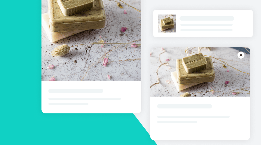
Banners are great for short, impactful messages or alerts that don't interrupt the user experience.
Image
Aspect Ratio: Square 1:1
Size: 256 x 256 px (max 3 MB)
Format: .jpg .png .gif
Copy
Title: max. ≈40 characters, max. ≈30 characters with an image
Message: max. ≈120 characters and ≈90 characters with an image
Cards offer a bit more space for creativity, perfect for promotions or announcements that require a bit more context.
Image
Aspect Ratio: Landscape 2:1
Size: 2048 x 1024 px (max 3 MB)
Format: .jpg .png .gif
Copy
Title: max. ≈40 characters
Message: max. ≈120 characters
Full-Screen Messages take center stage, providing a rich canvas for your most important announcements or offers.
Image
Aspect Ratio: Portrait (or Landscape) 1:2 (or 2:1)
Size: 2048 x 4056 px (max 3 MB)
Format: .jpg .png .gif
Copy
Title: max. ≈40 characters
Message: max. ≈120 characters
Remember, the key to successful in-app messaging lies in balance. Your messages should add value to the user experience, not detract from it.
Conclusion
Effective in-app messaging requires a blend of creativity, clarity, and a deep understanding of your user’s needs. By following these guidelines and constantly refining your approach, you can create in-app messages that not only capture attention but convert it into meaningful action.
Ready to take your in-app messaging to the next level? We'd love to hear from you! Share with us the types of in-app messages you find most engaging, and let's continue the conversation on creating content that converts.


