Introducing the React Preview Components library

Preview notifications on any platform or device.
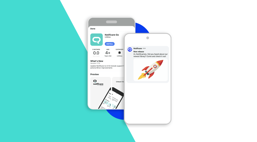
Do you want to be able to see all the types of notifications on different platforms and devices within your own web interface? This is the library for you.
🚀 What's new
Say hello to Notificare React Preview Components – a powerful and easy-to-use library that lets you preview Notificare's notifications using a simple React component. With this solution, you can easily visualize how your notifications will appear across different platforms and devices, right within your own web applications.
Want to check how a notification appears on Android? Or iOS? You’re in control, with a wide range of variants to explore. Depending on your workflow, having this kind of preview solution can make a real difference, and that's why we built it for you.
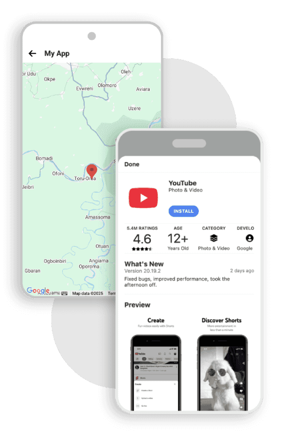
And this is just the beginning! While the first release focuses on push notifications, upcoming versions will support in-app messages and wallet passes as well. The goal? To cover a wide range of use cases and always provide the best possible experience.
👉 You can check out the library on NPM right here.
How to use it?
To fully access the library, you must first submit a request outlining its relevance to your use case. Please note that only existing clients or partners are eligible to use this library.
👉 You can follow the instructions in this guide to submit your request properly.
Once approved, you'll receive an API key, which you'll use with the provided components to start previewing notifications.
Features
Push notification previews
The <NotificareNotificationPreview /> component is designed to render a visual preview of a push notification. Below is a simple example of how to use it with a typical alert notification:
import { NotificareNotificationPreview } from 'notificare-react-preview-components';

export default function NotificationComposer() {
  return (
    <NotificareNotificationPreview
      notification={{
        type: 're.notifica.notification.Alert',
        title: '30% off on selected products',
        subtitle: 'From shirts, shoes, and much more!',
        message: "Visit our website now and find out more about the new discounts on our products. Don't miss out!",
        attachments: [
          {
            uri: 'https://t4.ftcdn.net/jpg/01/19/56/47/360_F_119564758_3Zj8GjaFFt9MVNkZYR7LvAGz6KS1JIqD.jpg',
            mimeType: 'image/jpeg',
          },
        ],
        actions: [
          {
            type: 're.notifica.action.Browser',
            label: 'Visit website',
            target: 'https://ncclothing.com/',
            camera: false,
            keyboard: false,
          },
        ],
      }}
      variant="web-desktop-macos"
      serviceKey="123"
      applicationId="123"
      googleMapsAPIKey="123"
      showControls={true}
    />
  )
}
To use this component, you’ll need to provide two required props:
notification: An object that contains all relevant details of the notification, such as the title, message, attachments, and actions. If you have already dealt with our notifications in some integration of yours, the structure should feel very familiar.
serviceKey: This is the API key you’ll receive after submitting a request, as described earlier in this guide.
Provide any application you want
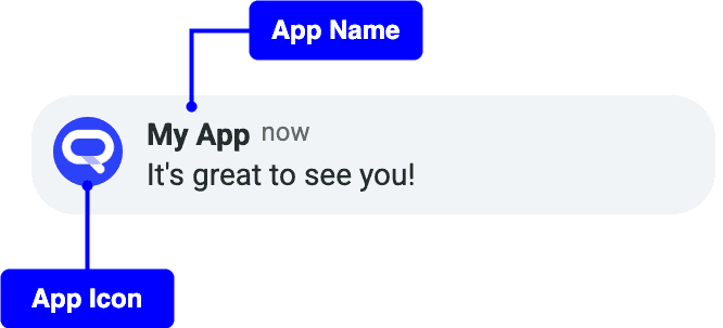
Want your previews to reflect the look and feel of a specific app? Just provide an applicationId. We'll automatically use your app's branding — including its icon, name, domain, and more — for a more realistic preview experience.
If you don't provide an applicationId, no worries! We'll use default placeholder data.
Choose which preview you want to see
You can optionally provide a variant to define in which environment the notification preview should be displayed by default. For example: do you want to see the notification on a phone's lockscreen, inside the app UI, or perhaps from a web perspective? It's your choice.
But that’s not all. You can also switch between different views dynamically using built-in UI controls — what is controlled by the showControls property.
These preview controls are enabled by default, but you can disable them if needed.
The controls look like this:
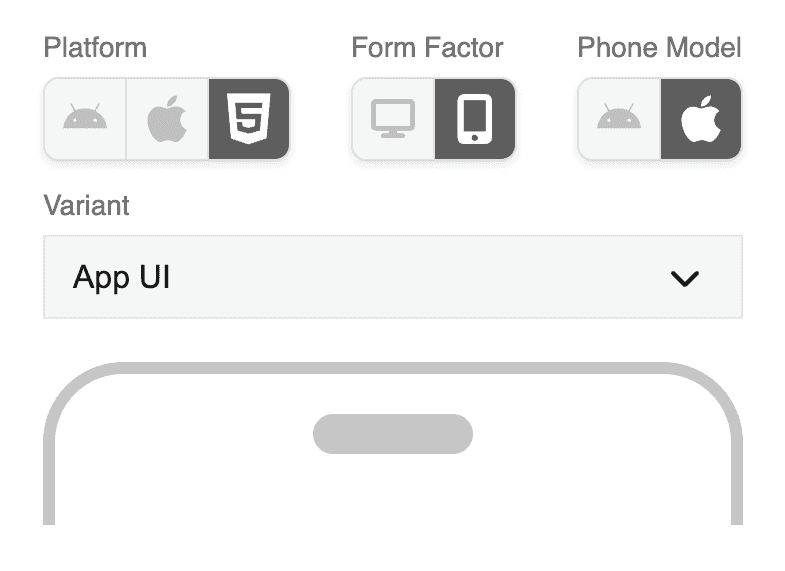
The preview controls appear at the top of the preview, allowing you to switch between different options. First, you decide in which platform you want the preview to be shown on: Android, iOS or Web.
On Android and iOS, you can view the notification as it would appear on the lockscreen (expanded or not) or inside the app. That said, you'll be able to choose between three possible variants: Lockscreen, Lockscreen Expanded or App UI.
For the web platform, it's a bit different. You can select between two form factors: desktop or phone (Android or iPhone).
If you choose desktop, you will only be able to see the notification preview from the macOS perspective. In the future, we plan to support more operating systems, such as Windows, to provide a more complete experience.
Alternatively, if you choose phone, you can select between Android and iPhone models. Currently, the only available variant is the App UI, which lets you preview how the notification will appear within the application website. We plan to add lock screen variants in future updates.
Google Maps API Key
For map notifications (type re.notifica.notification.Map) you need to provide one additional property for it to function correctly: googleMapsAPIKey. You can generate this API key through your own Google Cloud project. This is required, as Google Maps services cannot be used without a valid API key — otherwise, you'll get an error message.
👉 You can check how to do this in the following guide made by Google: Use API Keys | Maps Embed API
Examples
Here's how the alert notification provided earlier looks from different perspectives:
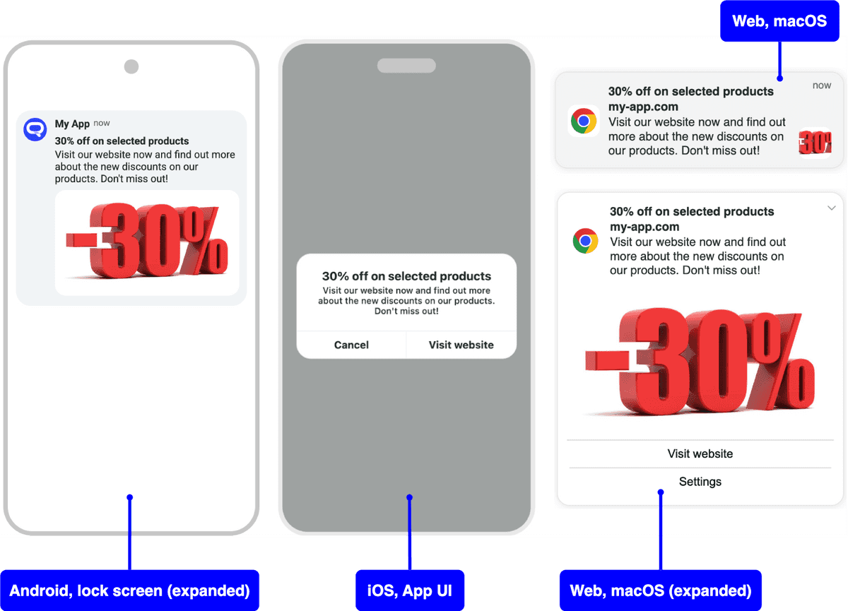
❗Want a deep dive into all available properties and configuration options? You can check out the full reference here.
Conclusion
Notificare React Preview Components is a flexible tool built to help you visualize how your content will look across different devices, platforms, and contexts — whether on Android, iOS, or Web. This tool gives you the power to preview approximately what users will see — without needing a physical device.
With upcoming support for in-app messages and wallet passes previews, we're committed to making this the go-to tool for all the channels you care about.
Give it a try, integrate it into your workflow, and let us know what you think — your feedback helps us shape what comes next! 👉 You can check the official repository right here, where you'll find detailed documentation that will help get started.
As always, we are available via our Support Channel for any question you might have.
